Foundations provides toolbox of visual design guidelines and elements that help build the Nemetschek Group brand.
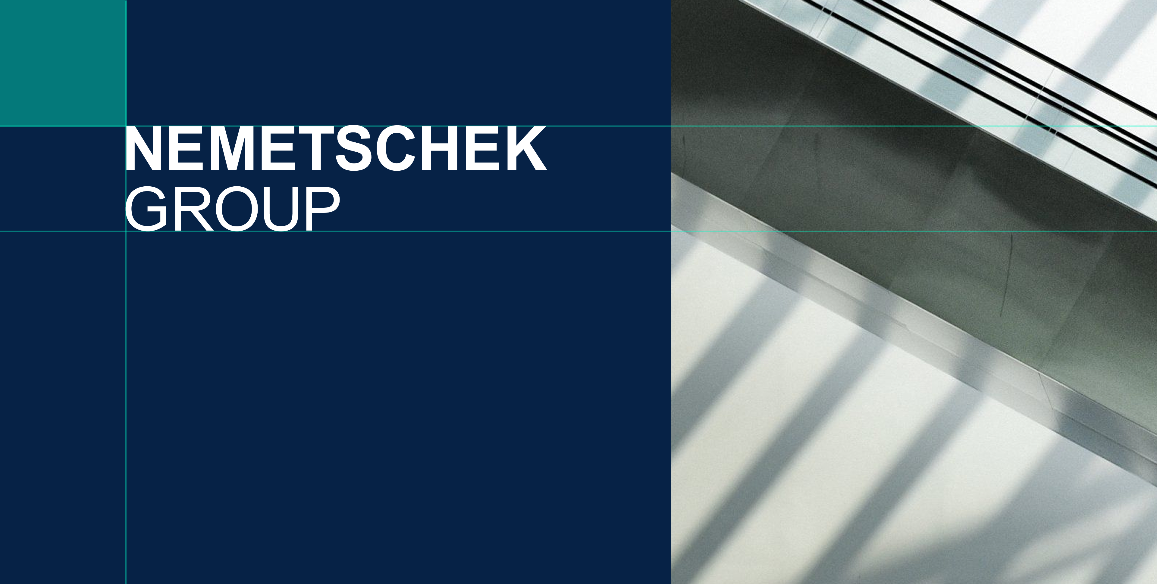
Layout Principles
The Nemetschek Group brand maintain clean, consistent alignment across all components. Strong alignment strengthens structure, improves hierarchy, and anchors the composition.
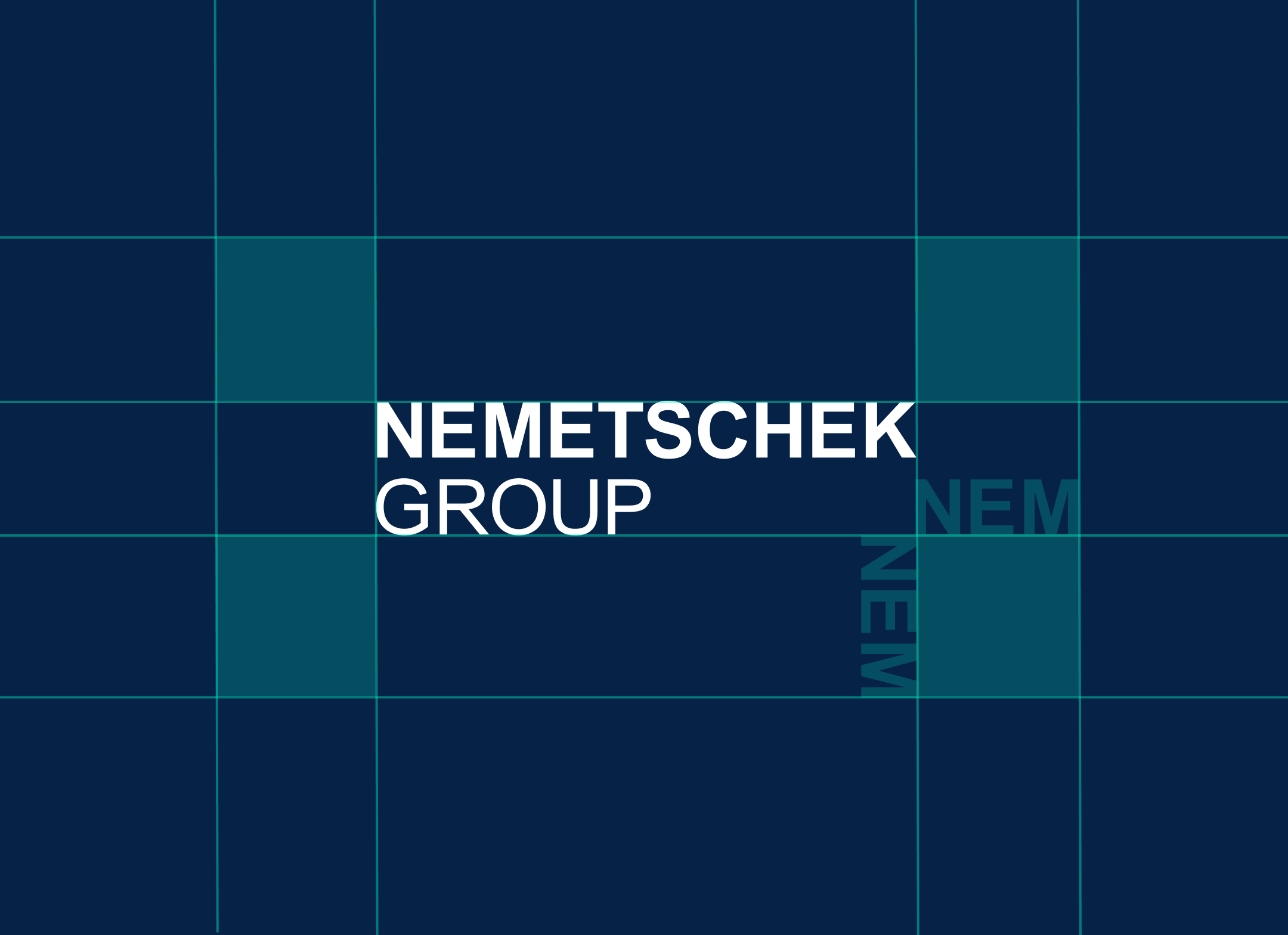
To maintain the logo’s integrity, ensure it always has sufficient clear space around it. Use the width of “NEM” as the reference for the required clear space at any size.
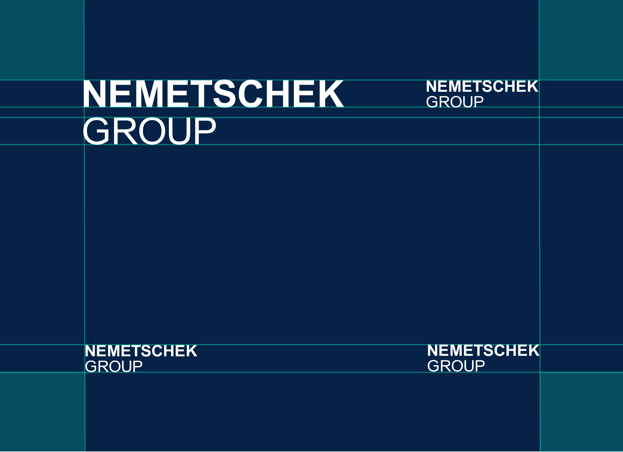
The preferred logo placement is the upper left corner. Alternative corner placements are permitted when design constraints require it.
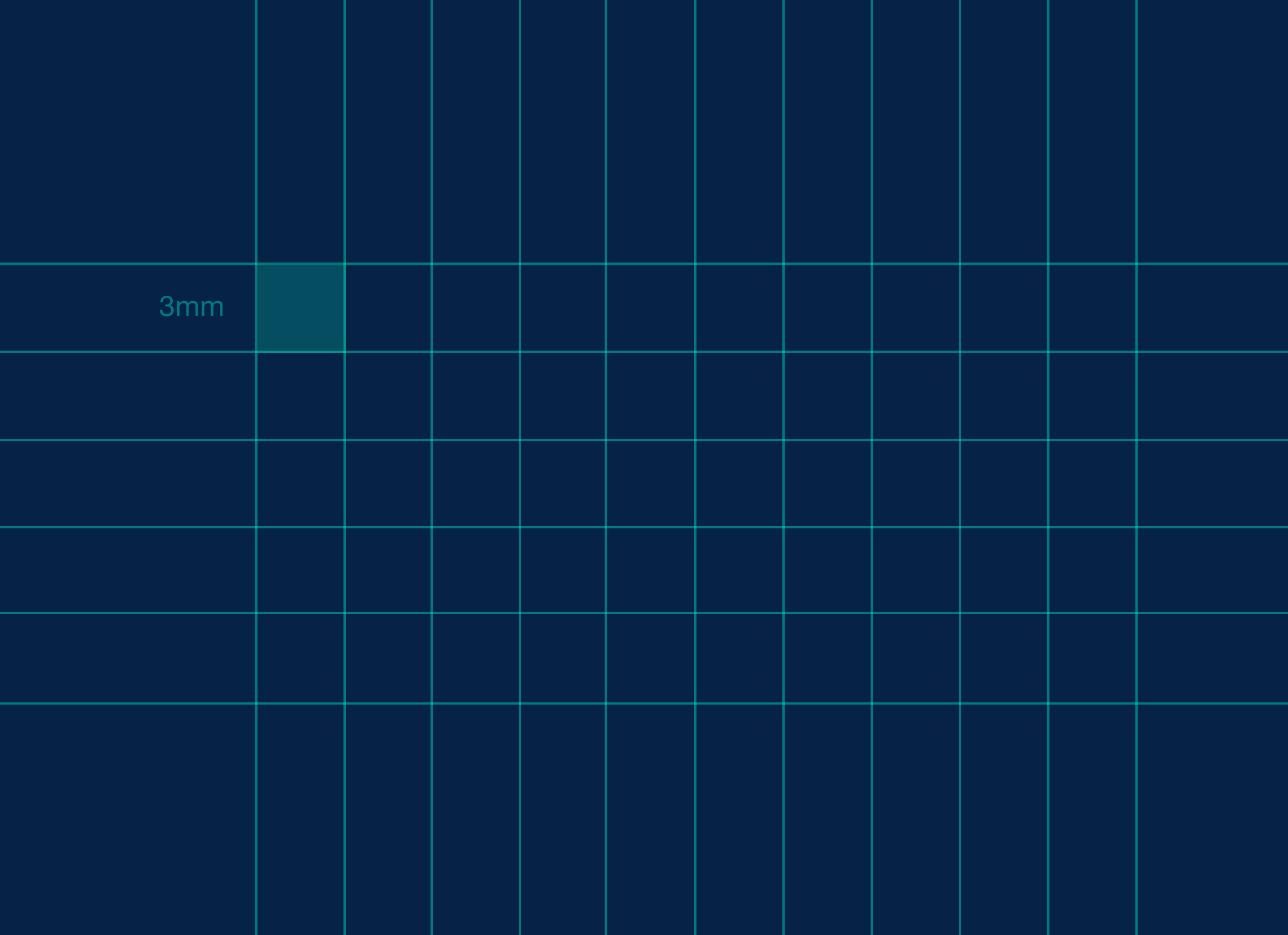
When designing artwork for the Nemetschek Group a 3 mm grid shoud be utilized on A4 standard page size. When the size of the artwork is increased or decreased the spacing and proportions of the logo should be adapted proportionally to the new size.
The Nemetschek Logo
The Nemetschek Group logo features a clean and structured design, consisting solely of a wordmark. It is primarily utilized without a slogan, although it can be strategically paired with a slogan on the website and in brand-related print materials.
The positive version of the logo is used on light backgrounds.

The inversed version of the logo is used on dark backgrounds and on images.
The positive version of the logo with slogan is used on light backgrounds. Wordmark with slogan should be positioned to the upper left hand corner of the design.
The inversed version of the logo with slogan is used on dark backgrounds and on images. Wordmark with slogan should be positioned to the upper left hand corner of the design.
Use the primary AI wordmark on light backgrounds. The AI badge is permanently paired with the Nemetschek Group wordmark and should appear as one unified signature.
Use the inverse AI wordmark on dark backgrounds and digital interfaces. In digital applications, the AI badge appears in the turquoise gradient to increase visibility and express the dynamic character of the AI identity.
Co-branding
The Nemetschek Group is an umbrella brand for a range of sub brands. This section explains the hierarchy and grids that maintains the brands integrity and consistency.
Nemetschek stands for a Group and faces the market with strong, independent brands globally. Therefore the individual brand logos move to the forefront in the brands communications and the Group takes a supportive role for the individual brands by using the modifier “A NEMETSCHEK COMPANY.”
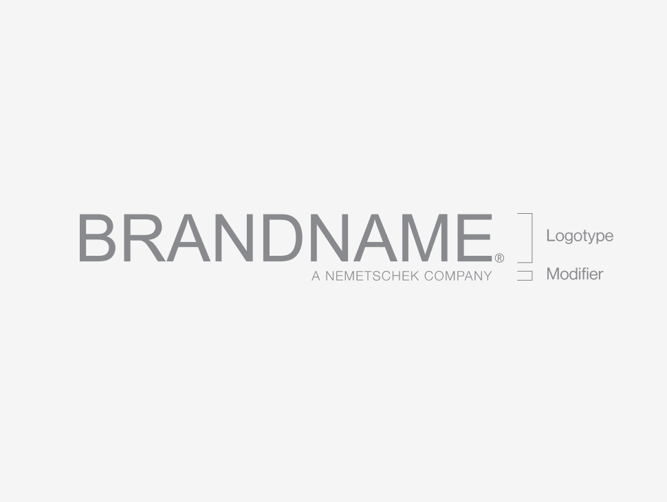
Single Brand Logo
All brands will incorporate the Group modifier ”A NEMETSCHEK COMPANY” as a separate element positioned just below each brand’s individual logo or word mark. The modifier is required to appear on all top-tier items.
Example of Single Brand Logo
The Modifiers should be right-aligned with the logotype with the exception of shorter than the modifier logos that should be left aligned.
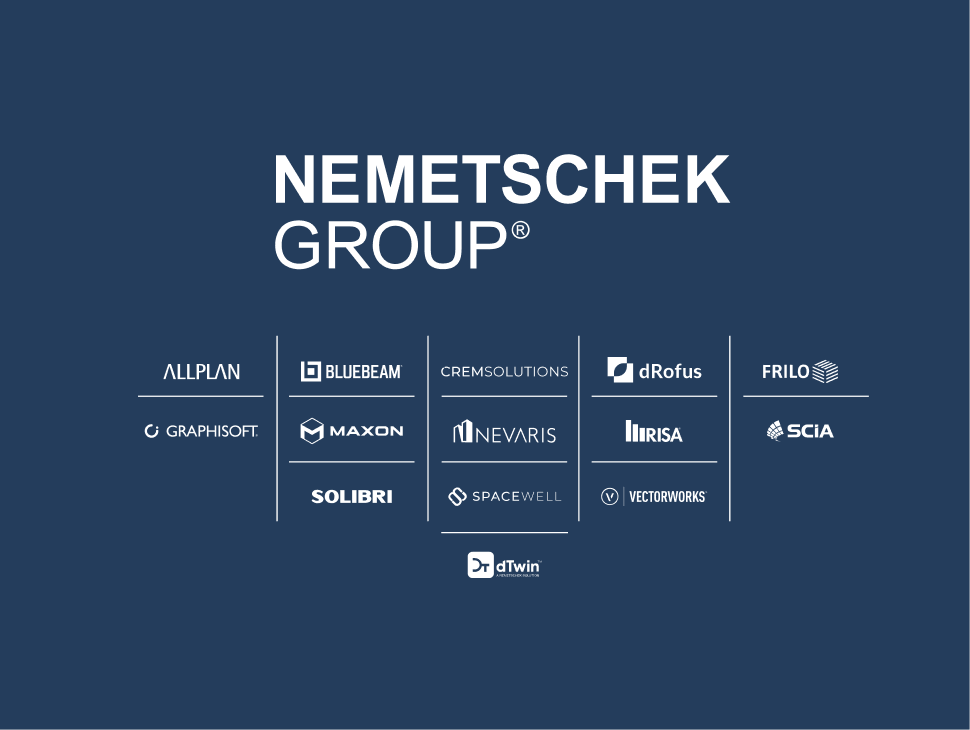
Co-branding / Company Brands
When Nemetschek Group brands are presented together with the Nemetschek Group logo they are shown as monochromatic versions, either in black, white or grey.
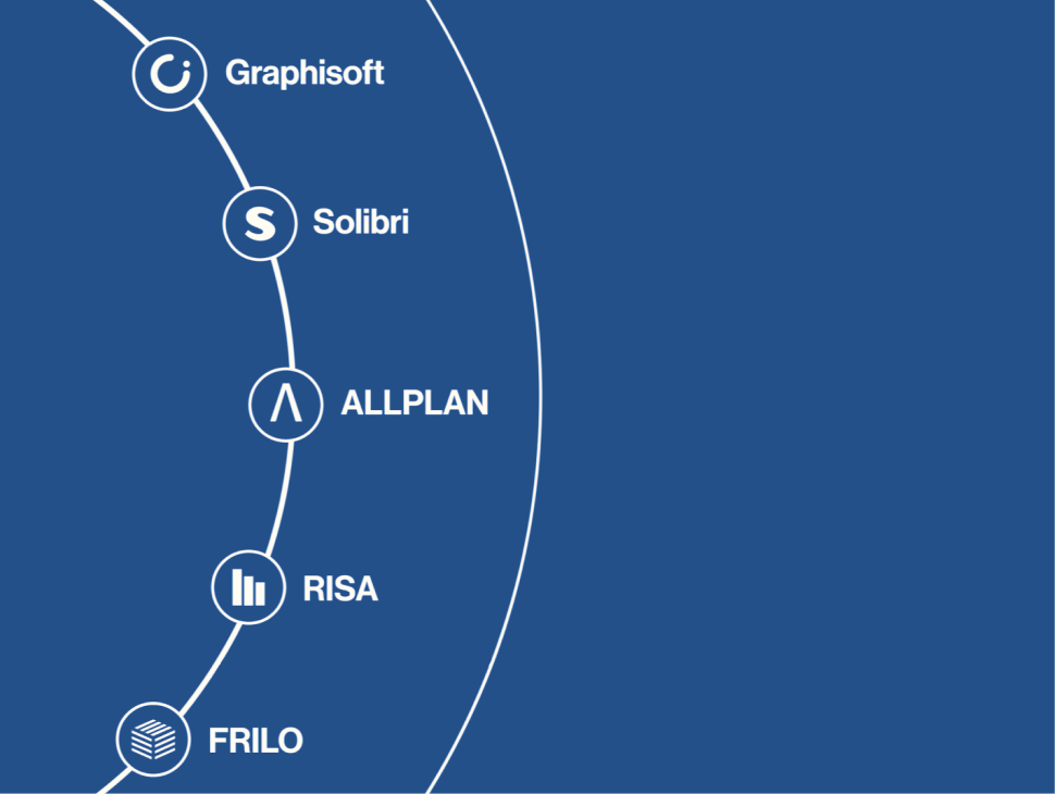
Co-branding / Product Brands
When presenting product brands together and with the Nemetschek Group logo, use the unified format: the product brand’s initial or emblem in a sphere, with the name set in the brand font Neue Haas Grotesk Display.
Typography
Typography is a key element of Nemetschek’s visual identity. Our typographic system reflects the brand’s precision, innovation, and clarity across all touchpoints.
- Roboto is the primary font, and ensures optimal readability and consistency across all screens while maintaining the same sense of precision and approachability. As an open-access typeface, it serves as the brand primary for as it supports broad usability and seamless integration across all platforms.
- Funnel Sans is used as sparsely as fallback option in programs such as the Microsoft Office Suite.
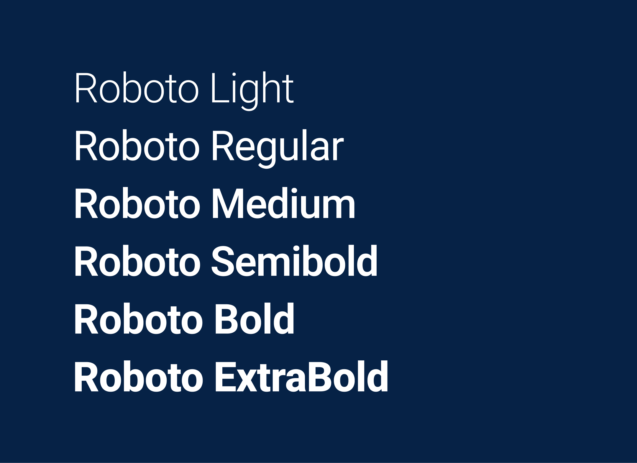
Roboto is Nemetschek’s brand typeface for all digital environments. It delivers modern clarity, high versatility, and excellent on-screen readability across interfaces and devices.
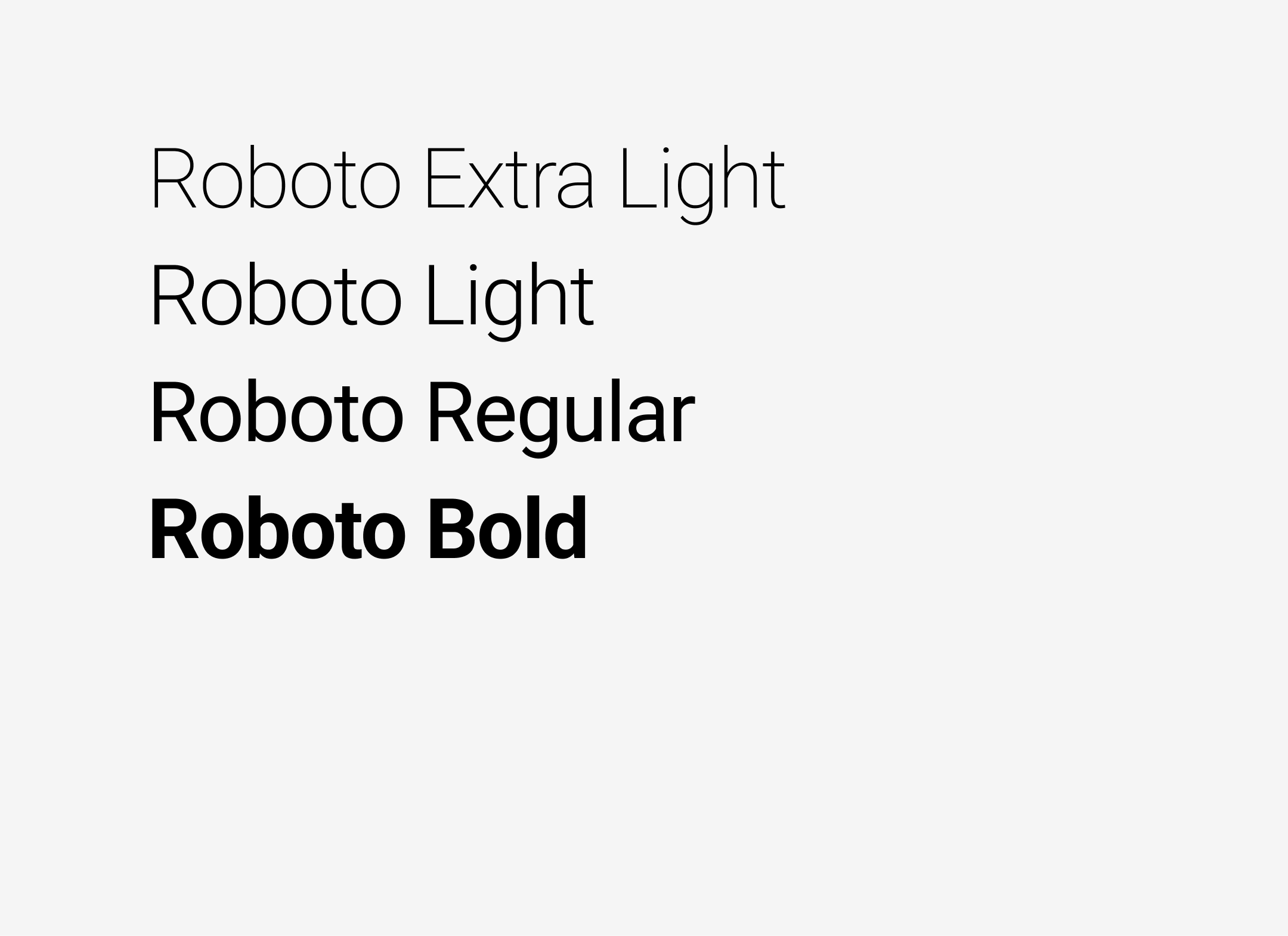
In print applications, the typeface is limited to fewer weights to ensure optimal legibility, cleaner reproduction, and a more refined hierarchy in static, high-resolution formats.

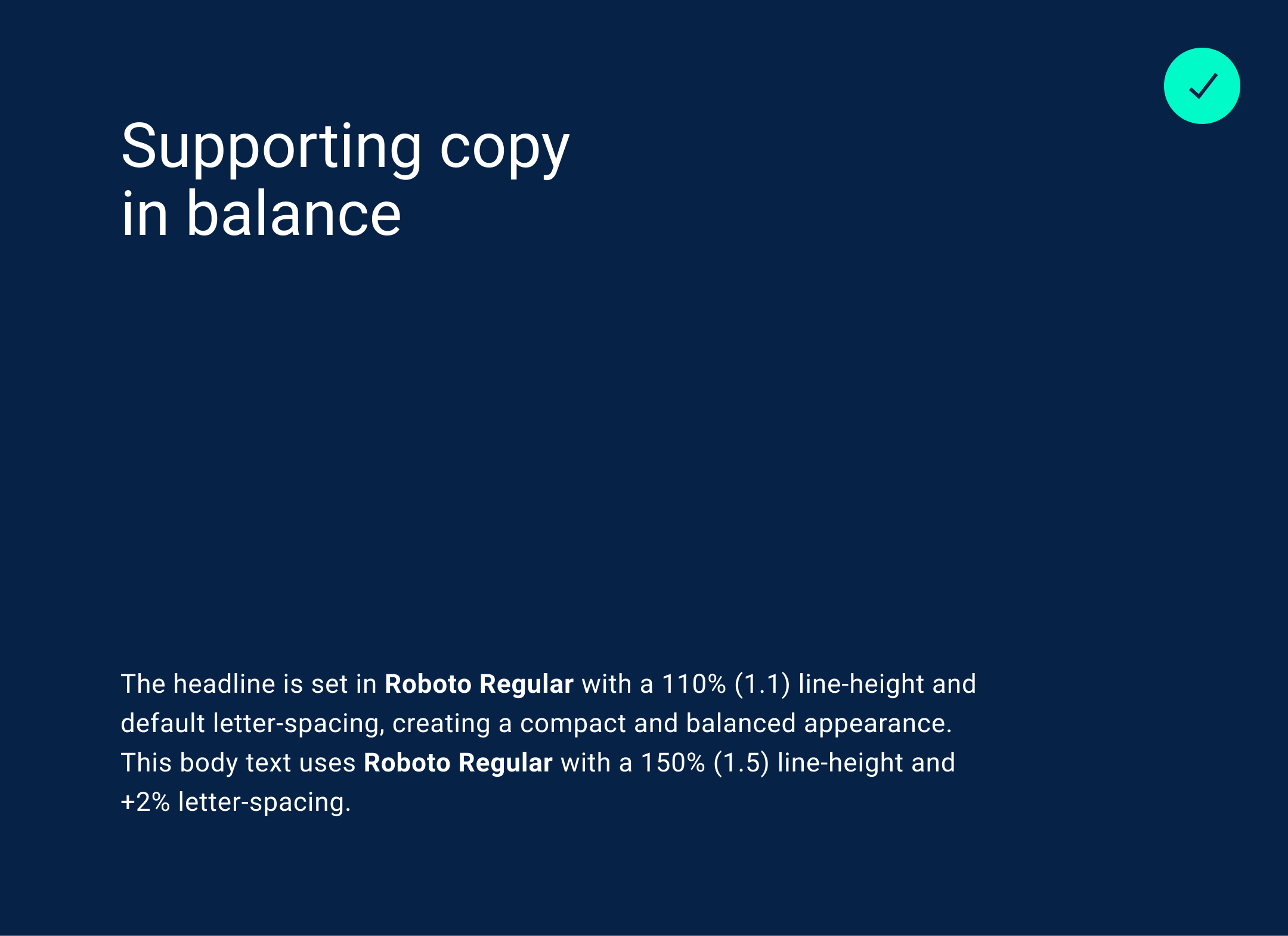
Supporting headlines are kept compact and neat; Keep line-height from 100%–120% and +1% to –2% letter-spacing for headlines. Give copy lines a bit more breathing with 130–160% line-height and 0 to +2% letter-spacing.
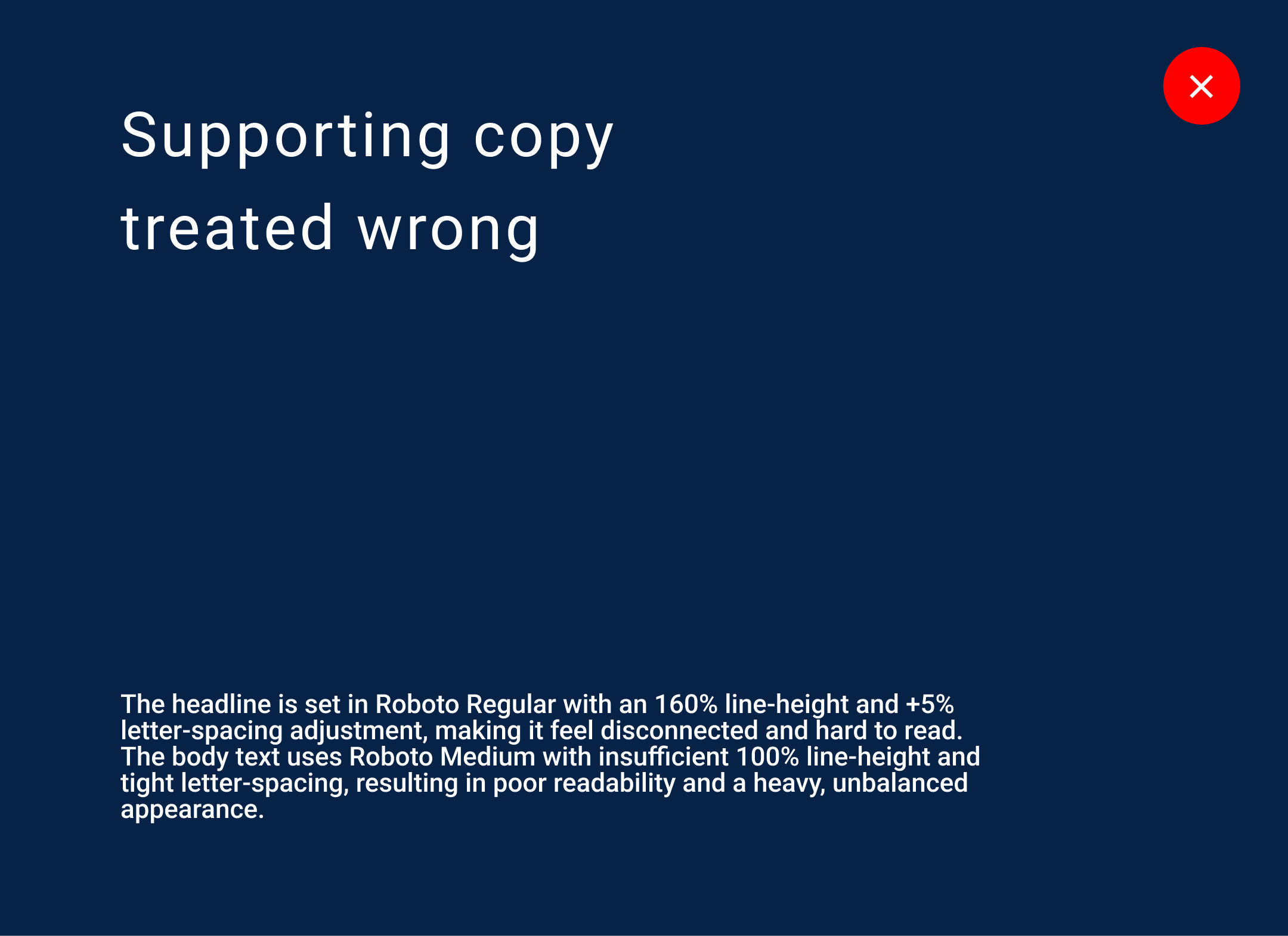
Headlines are kept compact and neat; Keep line-height from 100%–120% and +1% to –2% letter-spacing for headlines. Give copy lines a bit more breathing with 130–160% line-height and 0 to +2% letter-spacing.
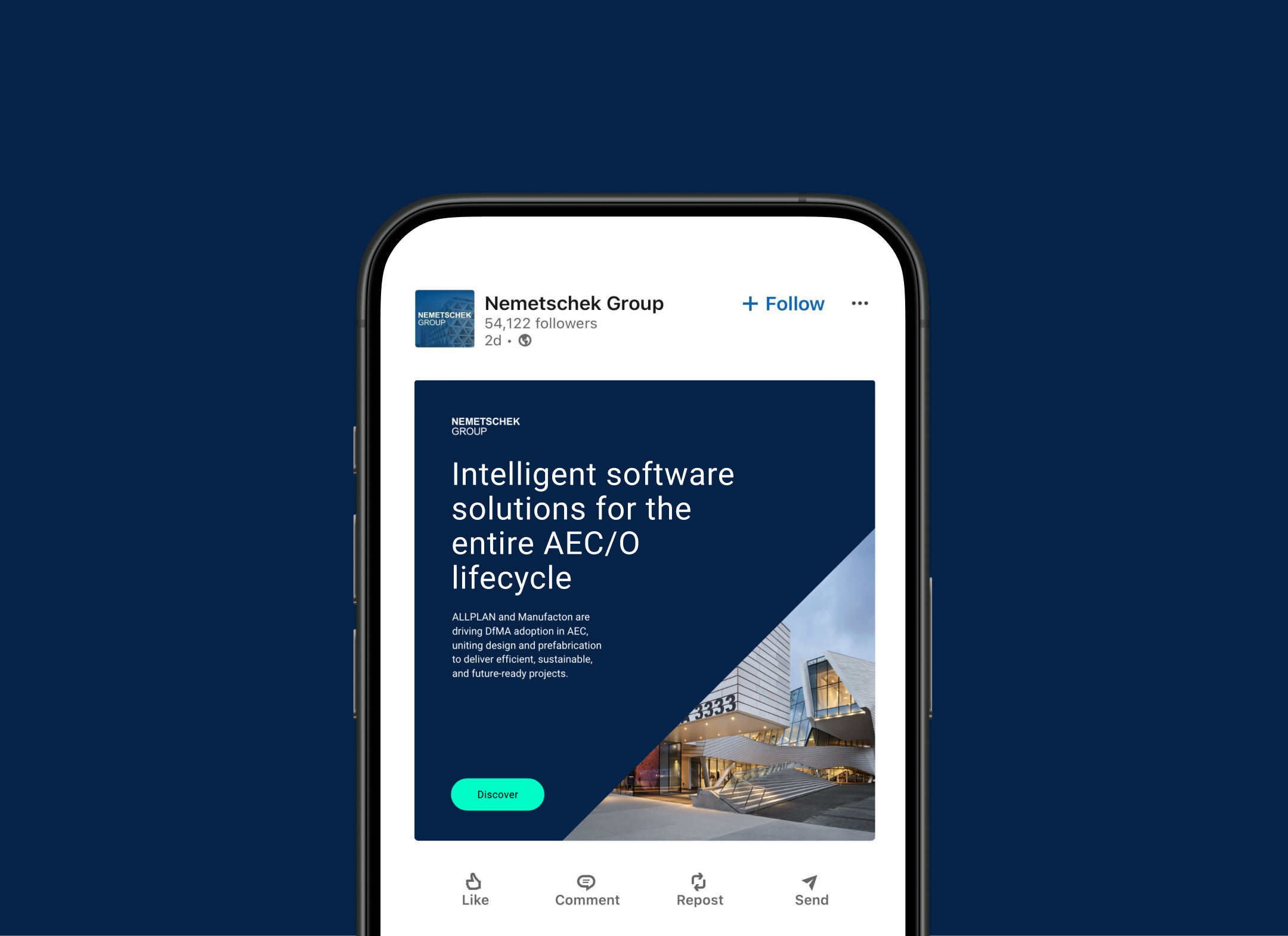
Roboto carries the Nemetschek voice across every touchpoint. In digital spaces, it delivers crisp clarity and confidence.
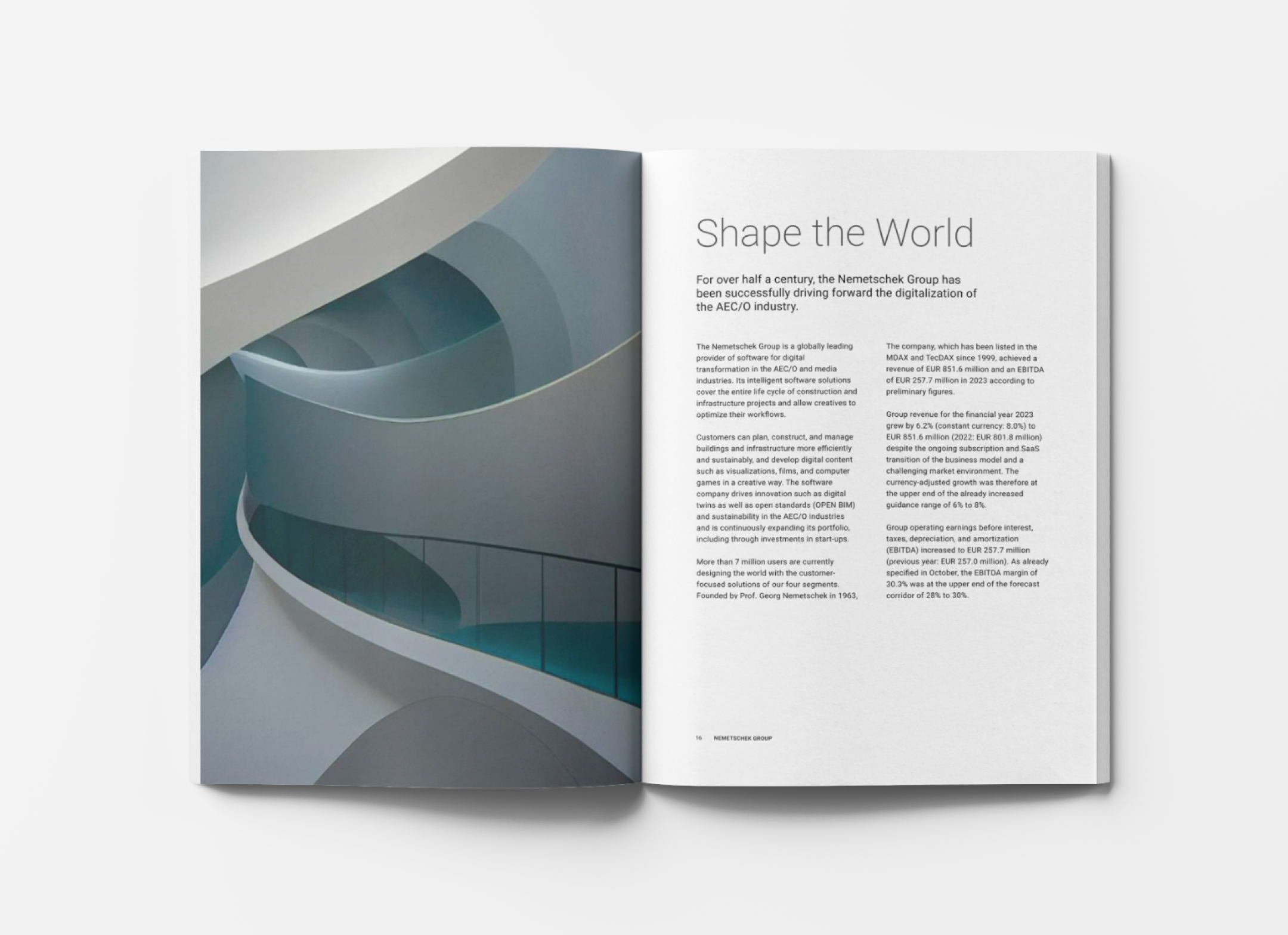
In print, it shifts into a more refined mode, using a tighter set of weights for sharp reproduction and a clean, elegant hierarchy.
The Nemetschek Group color system is built on two complementary palettes that create a clear and cohesive visual foundation. It’s helpful in creating visual hierarchy without unnecessary noise. Accent colors bring flexibility to the expression of our brand.
Brand Color Palettes
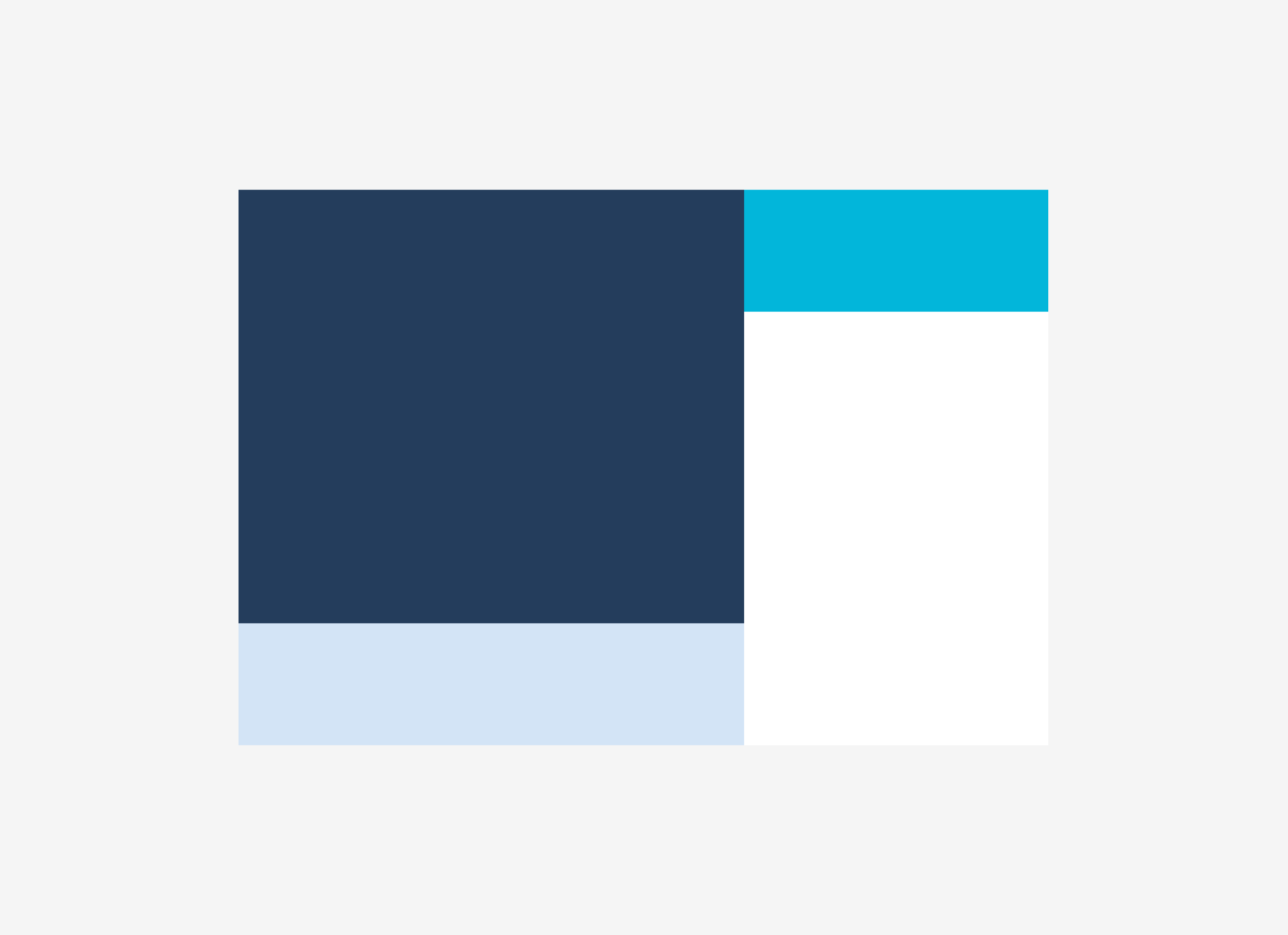
The print palette uses lighter tones to ensure reliable reproduction in physical materials. These colors provide clarity, contrast, and a calm, balanced presence across printed touch points.
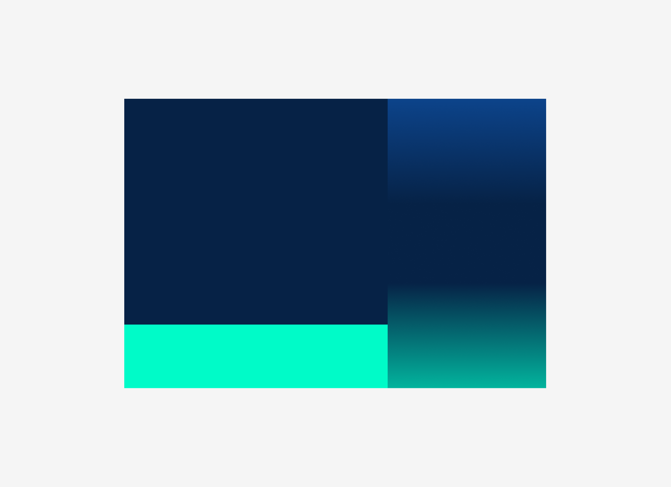
The digital palette features richer, deeper hues designed for on-screen use. These colors offer strong contrast, smooth gradients, and a vibrant, dynamic look that performs well in modern digital environments.

CMYK: 100%, 60%, 0%, 30%
RGB: 36, 61, 92
HEX: #243D5C
PMS: Pantone 300 + 30% K

CMYK: 100%, 55%, 0%, 0%
RGB: 54, 95, 148
HEX: #365F94
PMS: Pantone 300

CMYK: 50%, 20%, 0%, 0%
RGB: 117, 151, 194
HEX: #7597C2
PMS: Pantone 300 50%

CMYK: 20%, 6%, 0%, 0%
RGB: 211, 228, 246
HEX: #D3E4F6
PMS: Pantone 300 20%
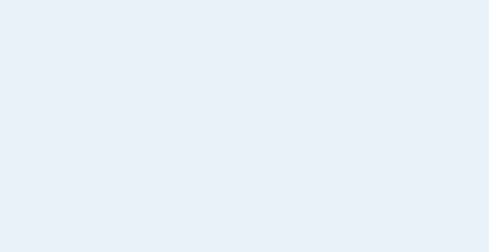
CMYK: 10%, 3%, 0%, 0%
RGB: 233, 241, 251
HEX: #E9F1FB
PMS: Pantone 300 10%

CMYK: 0%, 0%, 0%, 80%
RGB: 87, 87, 87
HEX: #575757

CMYK: 0%, 0%, 0%, 23%
RGB: 211-211-211
HEX: #D3D3D3

CMYK: 0%, 0%, 0%, 13%
RGB: 231-231-231
HEX: #E7E7E7

CMYK: 0%, 0%, 0%, 5%
RGB: 246, 246, 246
HEX: #F6F6F6

CMYK: 0%, 0%, 0%, 0%
RGB: 255, 255, 255
HEX: #FFFFFF
PMS: Pantone Bright White

CMYK: 100%, 20%, 0%, 40%
RGB: 0, 112, 148
HEX: #007094

CMYK: 100%, 15%, 0%, 5%
RGB: 2, 179, 100
HEX: #02B6DA

RGB: 6, 34, 70
HEX: #062246
Linear: #0F54AC to #062246

RGB: 0, 251, 200
HEX: #00FBC8
Linear: #062246 to #00FBC8
Use of Accent Color
The turquoise accent color bring flexibility and diversity to the expression of our brand—primarily as accents in promotional CTA buttons, as secondary or hover states in digital expressions and as accent colors in illustrations.
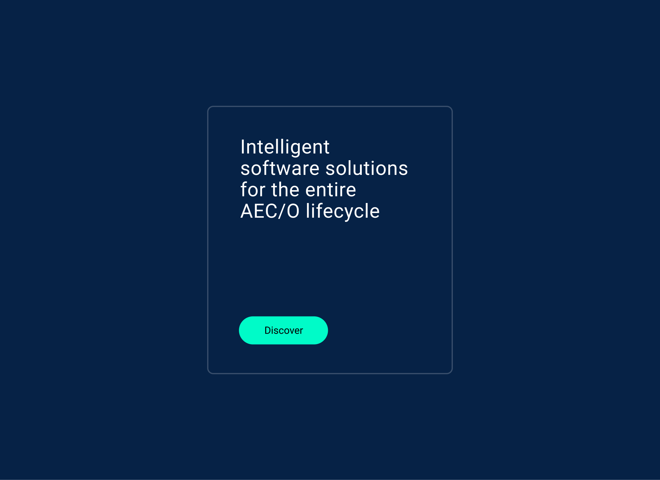
The vibrant accent color can be leveraged in digital promotional materials to highlight calls to action and emphasize key information.
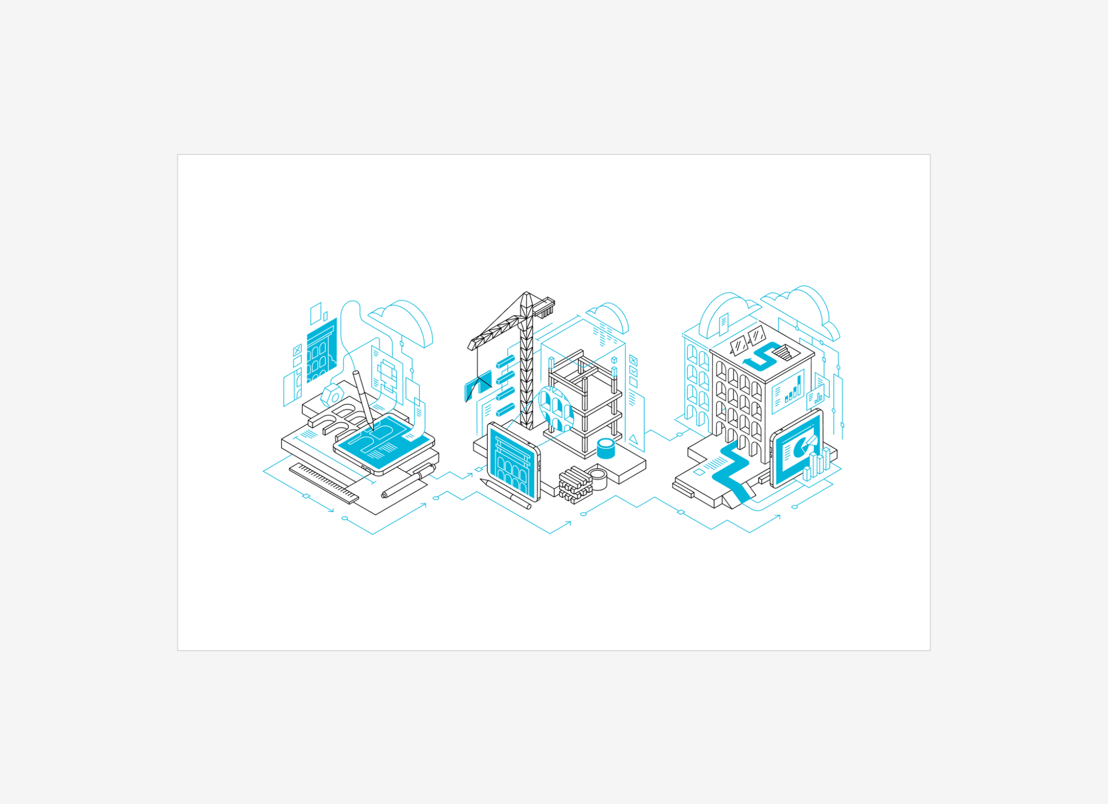
The accent color can serve as an effective complement to the primary colors when incorporated into illustrations.
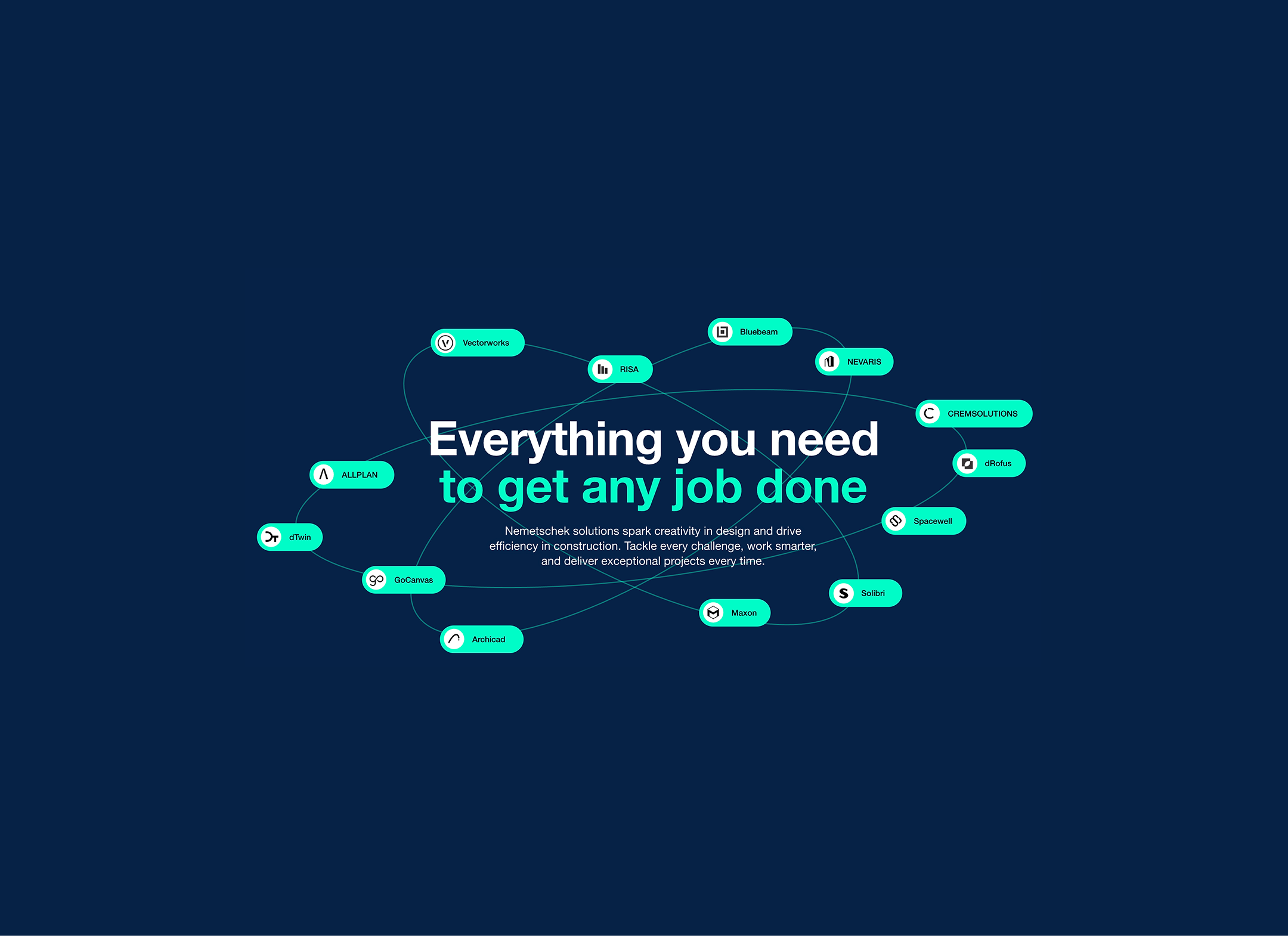
The turquoise color should be applied sparingly, primarily targeting promotional buttons, hover states, and serving as a tertiary color in graphs and charts.
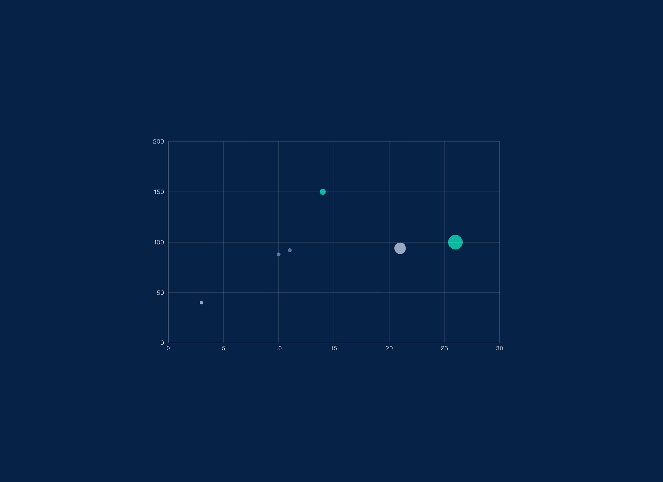
The turquoise color should be applied sparingly, primarily targeting promotional buttons, hover states, and serving as a tertiary color in graphs and charts.
Iconography
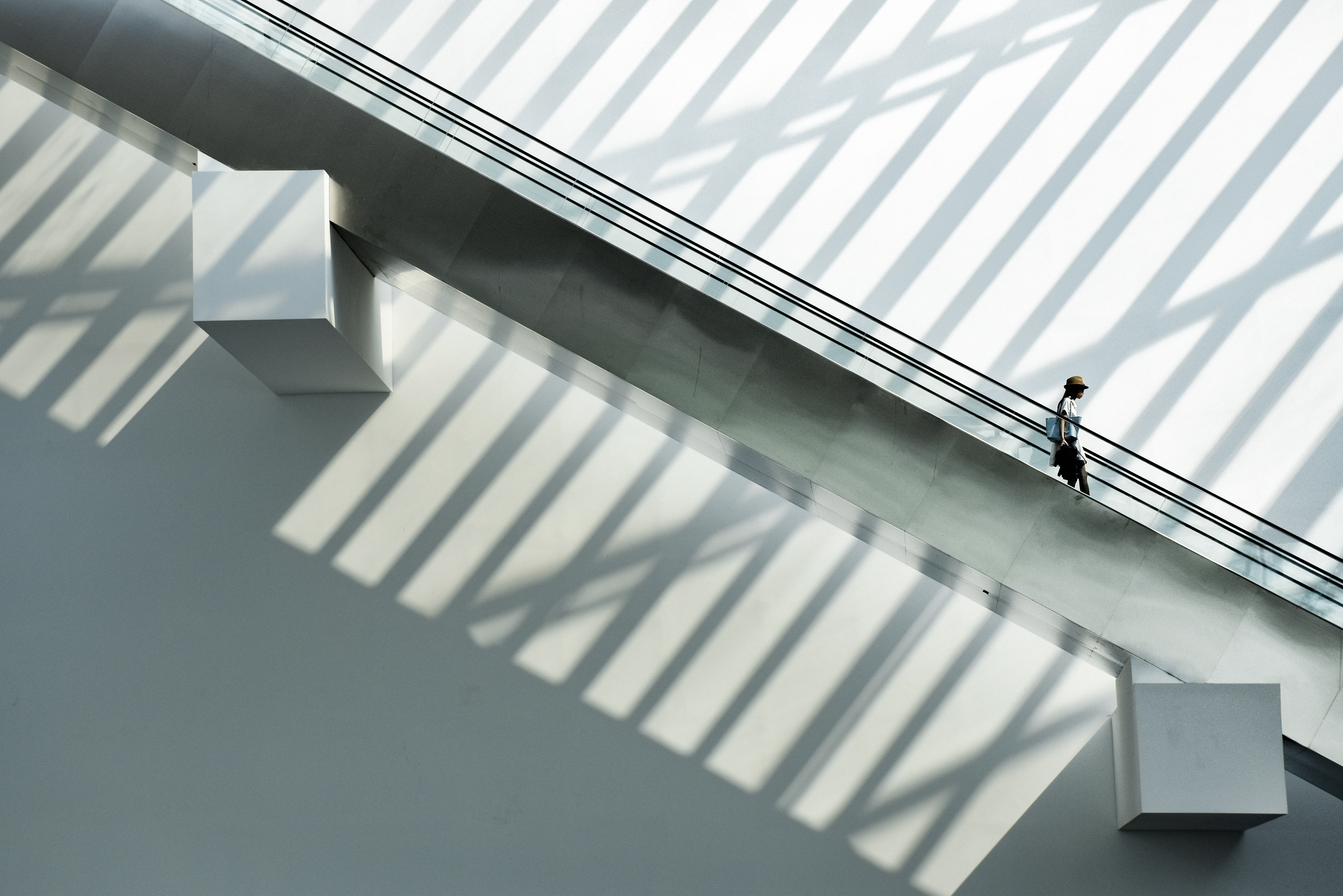
The Nemetschek’s imagery embodies a human centred, sustainable and innovative approach to the construction lifecycle.
Imagery
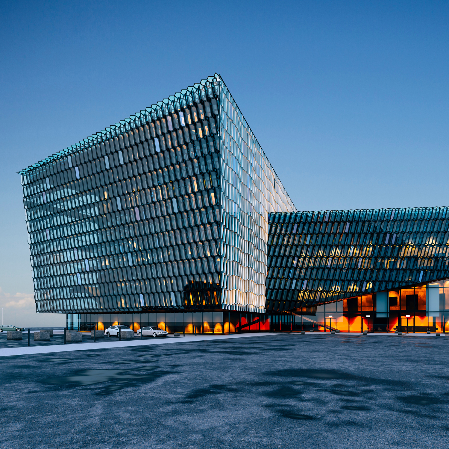
Nemetschek's brand imagery embodies modernity, innovation, and professionalism, emphasizing cutting-edge technology and reliable solutions for the architecture, engineering, construction, and operations (AECO) industries. It showcases seamless collaboration, sustainability, and future-oriented practices, reflecting the company's commitment to digital transformation and environmentally conscious building. The imagery includes diverse groups to highlight an inclusive work environment and features detailed visuals of architectural designs to underscore precision and technical excellence.


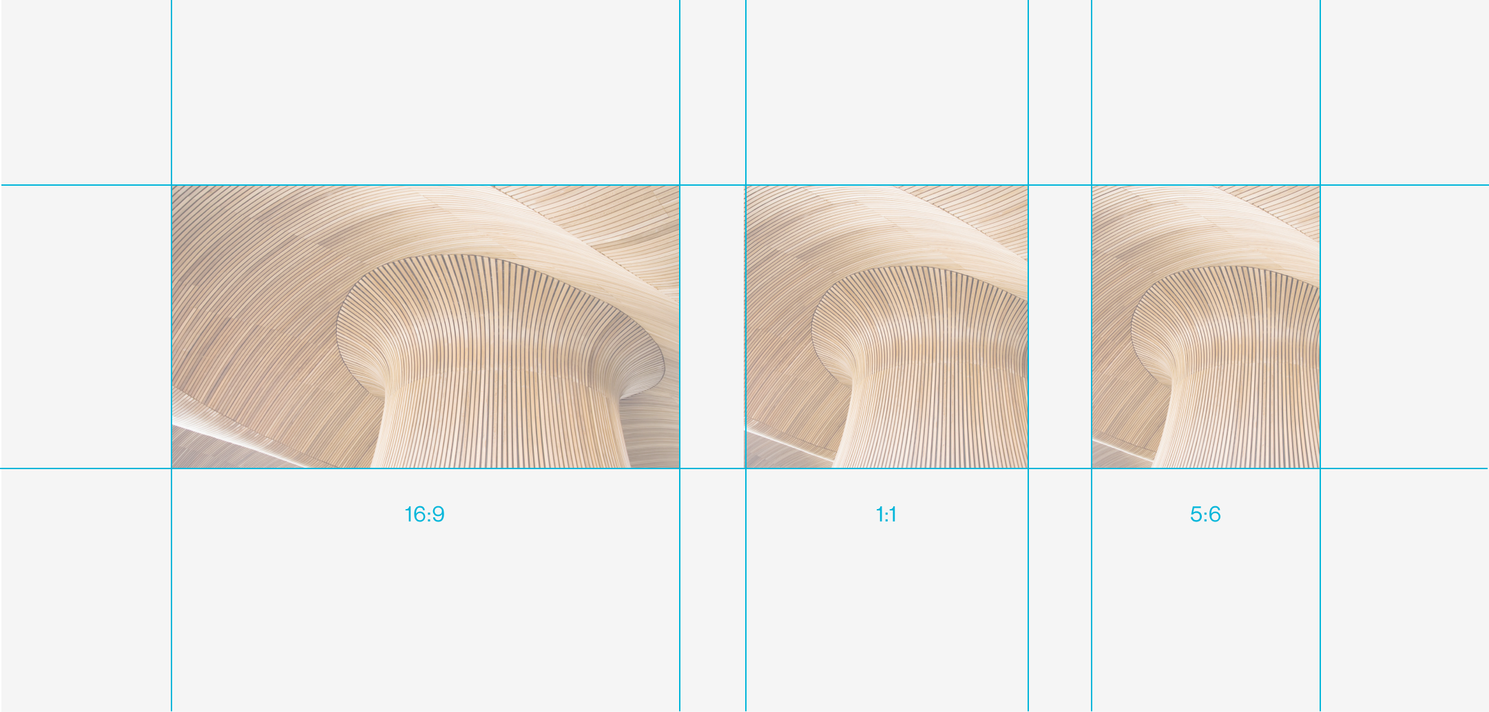
To scale across surfaces, platforms, or devices, photography can be cropped using one of three aspect ratios.
Video
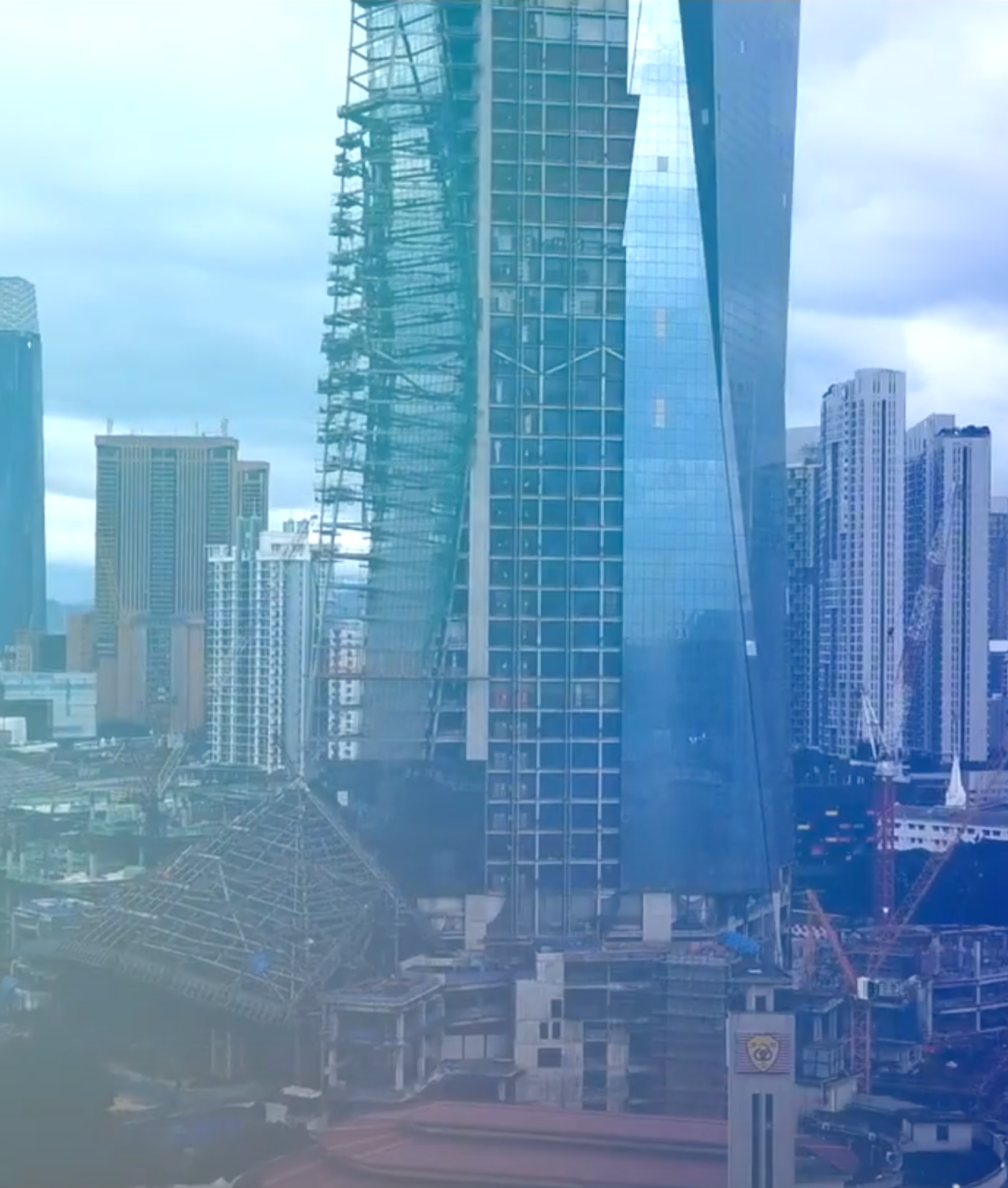
Nemetschek’s video materials embodies a human- centred, sustainable and innovative approach to the construction lifecycle.


Microsoft OfficeTemplates
The Nemetschek Group uses the Microsoft Suite to create compelling and consistent communication materials.
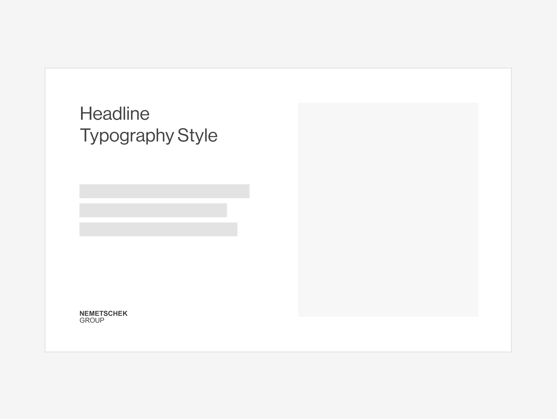
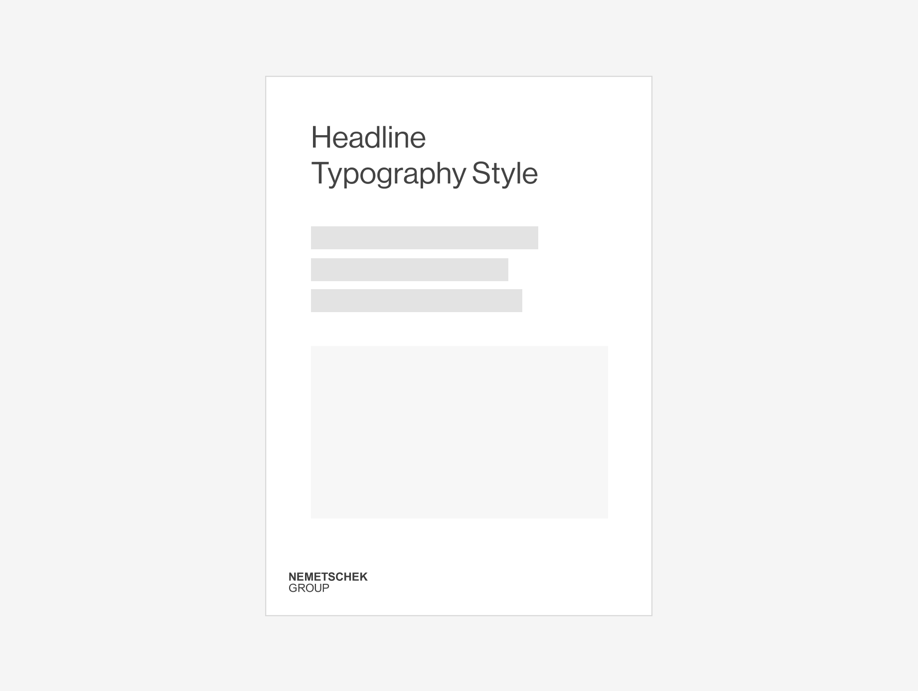
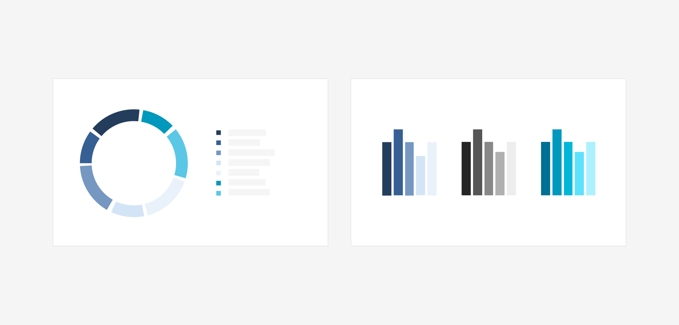
Chart styles are designed around the brand colors and their variations. Depending on the data being visualized, these colors can be used either in contrast with one another or within a single scale.

Email Signature
Your email signature represents our brand in every message you send. Keep it clear and simple. Your signature should include only the essentials: Full name, Job title, Company name, Address, Phone number(s), Email address, and Website link.